8.1. Stock Market Prediction
A recent post on Towards Data Science
(TDS) demonstrated the use of ARIMA models to predict stock market data with raw statsmodels.
This post addresses the same problem using pmdarima’s auto-ARIMA, and ends up achieving a
different result with an even lower error rate.
8.1.1. Imports & data loading
For this example, all we’ll need is Numpy, Pandas and pmdarima. Matplotlib is optional,
but highly encouraged in order to qualitatively validate the results of the model fit.
To run this example, you’ll need pmdarima version 1.5.2 or greater. If you’re
running this in a notebook, make sure to include %matplotlib inline, or the plots
will not show up under your cells!
This example was also designed for Python 3.6+. If you’re running python 3.5, simply remove the F-string print statements and it will work.
import numpy as np
import pandas as pd
import matplotlib.pyplot as plt
# %matplotlib inline

import pmdarima as pm
print(f"Using pmdarima {pm.__version__}")
# Using pmdarima 1.5.2
The pmdarima module conveniently includes the dataset we’ll be using as an internal
utility. Rather than carting around .csv files, you can simply load the data from
the package:
from pmdarima.datasets.stocks import load_msft

df = load_msft()
df.head()
| Date | Open | High | Low | Close | Volume | OpenInt |
| 1986-03-13 | 0.06720 | 0.07533 | 0.06720 | 0.07533 | 1371330506 | 0 |
| 1986-03-14 | 0.07533 | 0.07533 | 0.07533 | 0.07533 | 409569463 | 0 |
| 1986-03-17 | 0.07533 | 0.07533 | 0.07533 | 0.07533 | 176995245 | 0 |
| 1986-03-18 | 0.07533 | 0.07533 | 0.07533 | 0.07533 | 90067008 | 0 |
| 1986-03-19 | 0.07533 | 0.07533 | 0.07533 | 0.07533 | 63655515 | 0 |
8.1.2. Data splitting
As with all statistical and ML modeling, we need to make sure we’ve split our data so we can evaluate model performance on a hold-out set. However, unlike other traditional supervised learning, time series models intrinsically introduce endogenous temporality, meaning that the values at any given point \(y_{t}\) in our time series likely have some effect on some future value, \(y_{t+n}\). Therefore, we cannot simply split our data randomly; we must make a clean split in our time series (and exogenous variables, if present).
As in the TDS example, we’ll use \(0.8 * dataSize\) as our training sample.
8.1.3. Pre-modeling analysis
As you may know (if not, venture over to Tips to using auto_arima before continuing), an ARIMA model has 3 core hyper-parameters, known as “order”:
- \(p\): The order of the auto-regressive (AR) model (i.e., the number of lag observations)
- \(d\): The degree of differencing.
- \(q\): The order of the moving average (MA) model. This is essentially the size of the “window” function over your time series data.
Part of the science behind the auto-arima approach is intelligently finding the proper
combination of p, d, q such that you achieve the best fit. The TDS article took the
approach of fixing the \(p\) parameter at 5 after examining auto-correlations with
lag plots. A lag plot can provide clues about the underlying structure of your
data [1]:
- A linear shape to the plot suggests that an autoregressive model is probably a better choice.
- An elliptical plot suggests that the data comes from a single-cycle sinusoidal model.
from pandas.plotting import lag_plot

fig, axes = plt.subplots(3, 2, figsize=(8, 12))
plt.title('MSFT Autocorrelation plot')

# The axis coordinates for the plots
ax_idcs = [
    (0, 0),
    (0, 1),
    (1, 0),
    (1, 1),
    (2, 0),
    (2, 1)
]

for lag, ax_coords in enumerate(ax_idcs, 1):
    ax_row, ax_col = ax_coords
    axis = axes[ax_row][ax_col]
    lag_plot(df['Open'], lag=lag, ax=axis)
    axis.set_title(f"Lag={lag}")

plt.show()
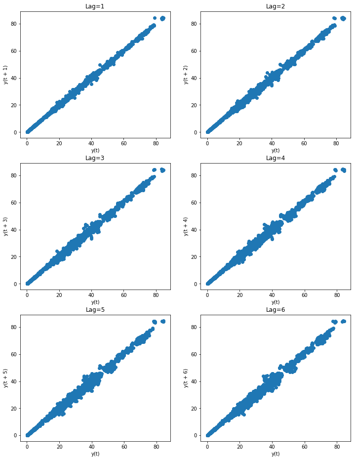
As you can see, all the lags look fairly linear, so it’s a good indicator that
an auto-regressive model is a good choice. But since we don’t want to allow simple
visual bias to impact our decision here, we’ll allow the auto_arima to select
the proper lag term for us.
8.1.3.1. Estimating the differencing term
The TDS article selected \(d=1\) as the differencing term. But how did they make that choice? With pmdarima, we can run several differencing tests against the time series to select the best number of differences such that the time series will be stationary.
Here, we’ll use the KPSS test and
ADF test, selecting
the maximum value between the two to be conservative. Fortunately, in this case, both
tests indicated that \(d=1\) was the best answer, but in the case where they disagreed,
we could try both or allow auto_arima to auto-select the d term.
from pmdarima.arima import ndiffs

kpss_diffs = ndiffs(y_train, alpha=0.05, test='kpss', max_d=6)
adf_diffs = ndiffs(y_train, alpha=0.05, test='adf', max_d=6)
n_diffs = max(adf_diffs, kpss_diffs)

print(f"Estimated differencing term: {n_diffs}")
# Estimated differencing term: 1
Therefore, we will use \(d=1\).
8.1.4. Fitting our model
Now it’s time to let the auto_arima method do its magic:
auto = pm.auto_arima(y_train, d=n_diffs, seasonal=False, stepwise=True,
                     suppress_warnings=True, error_action="ignore", max_p=6,
                     max_order=None, trace=True)
Notice that we preset d=n_diffs, since we’ve already settled on a value for d.
However, we’re allowing our ARIMA models explore various values of p and q.
After a few seconds, we arrive at the following solution:
print(auto.order)
# (0, 1, 0)
Where the TDS model was of order (5, 1, 0), we ended up selecting a significantly
more simple model. But how does it perform?
8.1.5. Updating the model
Now that the heavy lifting of selecting model hyper-parameters has been performed, we can update our model by simulating days passing with our test set. For each new observation, we’ll let our model progress for several more iterations, allowing MLE to update its discovered parameters and shifting the latest observed value. Then we can measure the error on the forecasts:
from sklearn.metrics import mean_squared_error
from pmdarima.metrics import smape

model = auto  # seeded from the model we've already fit

def forecast_one_step():
    fc, conf_int = model.predict(n_periods=1, return_conf_int=True)
    return (
        fc.tolist()[0],
        np.asarray(conf_int).tolist()[0])

forecasts = []
confidence_intervals = []

for new_ob in y_test:
    fc, conf = forecast_one_step()
    forecasts.append(fc)
    confidence_intervals.append(conf)

    # Updates the existing model with a small number of MLE steps
    model.update(new_ob)

print(f"Mean squared error: {mean_squared_error(y_test, forecasts)}")
print(f"SMAPE: {smape(y_test, forecasts)}")
# Mean squared error: 0.34238951346274243
# SMAPE: 0.9825490519101439
In the end, our model ended up way out-performing the TDS model!
| Source | MSE | SMAPE |
| pmdarima | 0.342 | 0.983 (!!) |
| TDS article | 0.343 | 40.776 |
8.1.6. Viewing forecasts
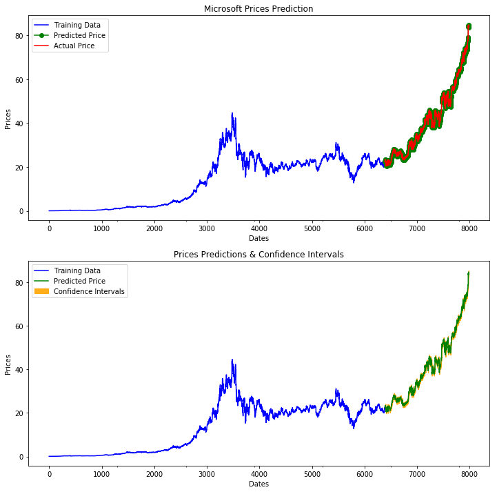
Let’s take a look at the forecasts our model produces overlaid on the actuals (in the first plot), and the confidence intervals of the forecasts (in the second plot):
fig, axes = plt.subplots(2, 1, figsize=(12, 12))

# --------------------- Actual vs. Predicted --------------------------
axes[0].plot(y_train, color='blue', label='Training Data')
axes[0].plot(test_data.index, forecasts, color='green', marker='o',
             label='Predicted Price')

axes[0].plot(test_data.index, y_test, color='red', label='Actual Price')
axes[0].set_title('Microsoft Prices Prediction')
axes[0].set_xlabel('Dates')
axes[0].set_ylabel('Prices')

axes[0].set_xticks(np.arange(0, 7982, 1300).tolist(), df['Date'][0:7982:1300].tolist())
axes[0].legend()


# ------------------ Predicted with confidence intervals ----------------
axes[1].plot(y_train, color='blue', label='Training Data')
axes[1].plot(test_data.index, forecasts, color='green',
             label='Predicted Price')

axes[1].set_title('Prices Predictions & Confidence Intervals')
axes[1].set_xlabel('Dates')
axes[1].set_ylabel('Prices')

conf_int = np.asarray(confidence_intervals)
axes[1].fill_between(test_data.index,
                     conf_int[:, 0], conf_int[:, 1],
                     alpha=0.9, color='orange',
                     label="Confidence Intervals")

axes[1].set_xticks(np.arange(0, 7982, 1300).tolist(), df['Date'][0:7982:1300].tolist())
axes[1].legend()
8.1.7. Conclusion
The TDS article provided an awesome example of how to use ARIMAs to predict stocks. Our hope in this example was to show how using pmdarima can simplify and enhance the models you build. If you’d like to run the already-setup notebook for yourself, head on over to the project’s Git page and grab the example notebook.